… … …
A rising number of schools in the UK are electing to adopt Comic Sans for use in hand-outs, certificates and project documentation. Comic Sans is a very stylised rendition of a typeface, lacking in the exacting detailing, which considered typography usually demands. Any mention of Comic Sans within the design community will spark an avalanche of rants, rhetoric and heated debate – very few designers are willing to champion its use in any way, shape or form!
“Designers hate Comic Sans, for it undercuts the sanctity of their craft”.
The Guardian – In praise of… Comic Sans – 2009
In a recent eposide of Dragon’s Den showcased the work of a prospective entrepreneur in a pitch to gain investment for his ‘voice activated, feedback device’. In essence a label printer linked to voice recognition software – producing self adhesive labels containing printed feedback. A time saving device designed for teachers, to be used when grading work. http://www.markmate.co.uk
What typeface did the entrepreneur select to use for the feedback? – Yes, Comic Sans!
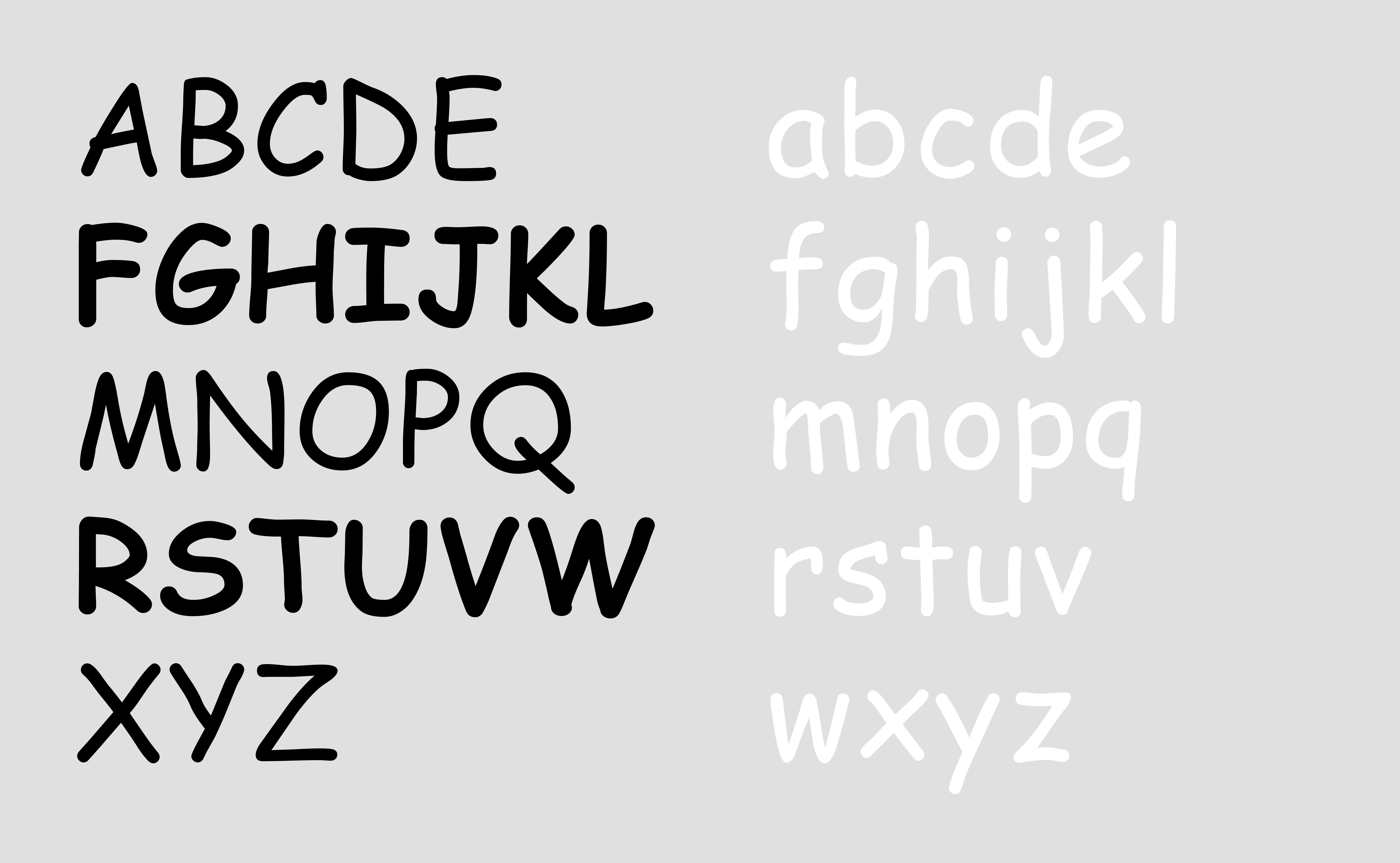
It’s legible, readable with an informal confidence. It is definitively not a valid selection for a large work of fiction, directional signage or interpretive materials for an exhibition. But, for brief passages of constructive criticism and feedback perhaps its choice can be qualified – after all, it is approachable, supportive and non confrontational – like a good teacher should be!
… … …
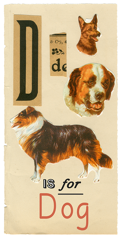
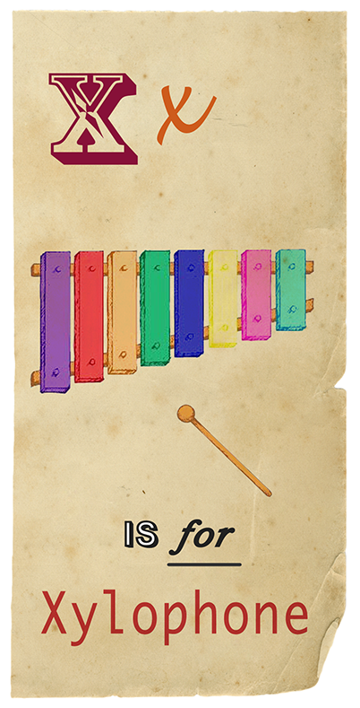
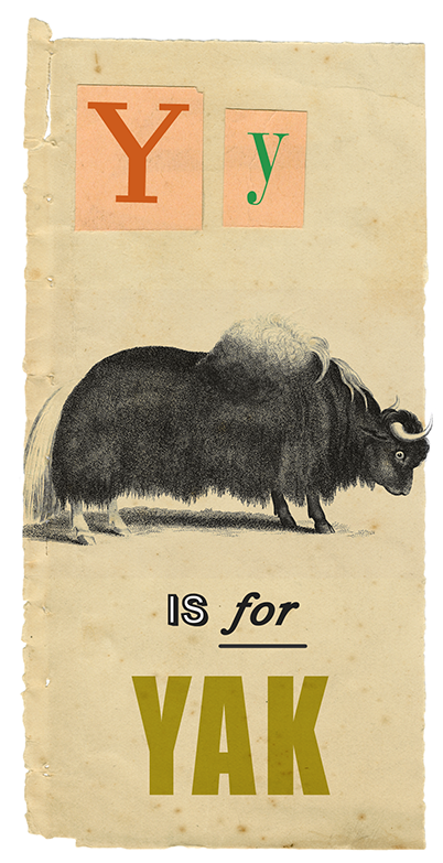
It all begins with A, B and C…
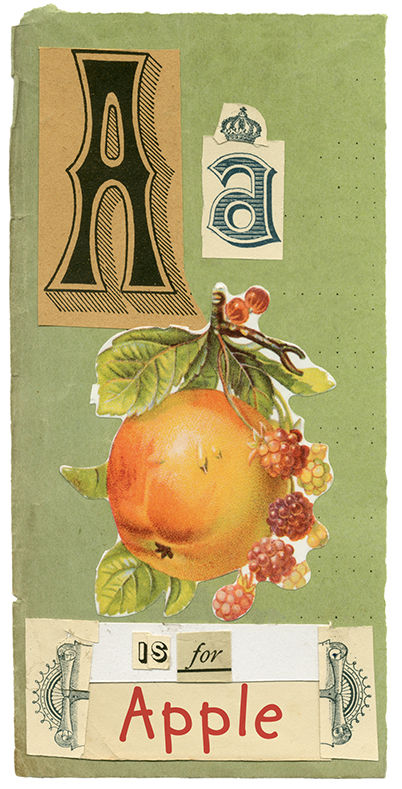
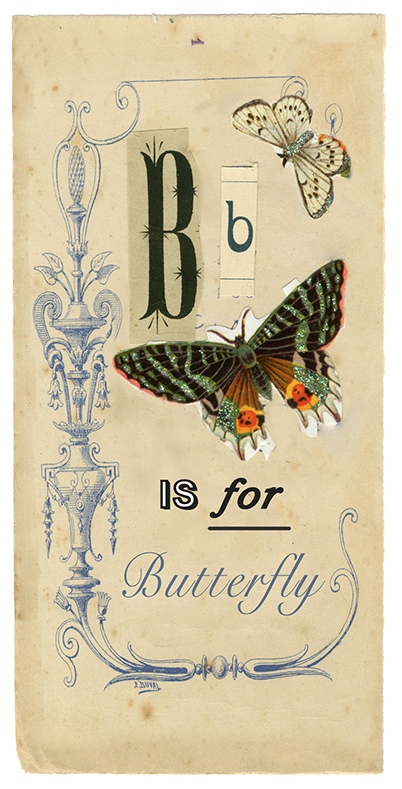

A small sample of my collage works, introducing the alphabet, designed for primary school aged children.
… … …